per diem, Mood & Habit Tracking App: UX Case Study
A mood & habit tracking app, with a focus on calm, clean, user-focused UI/UX
Task
Research-driven product design from concept to visualization and testing
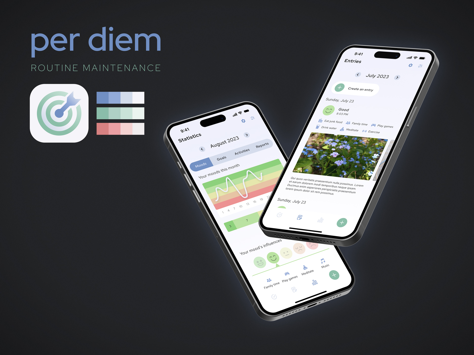
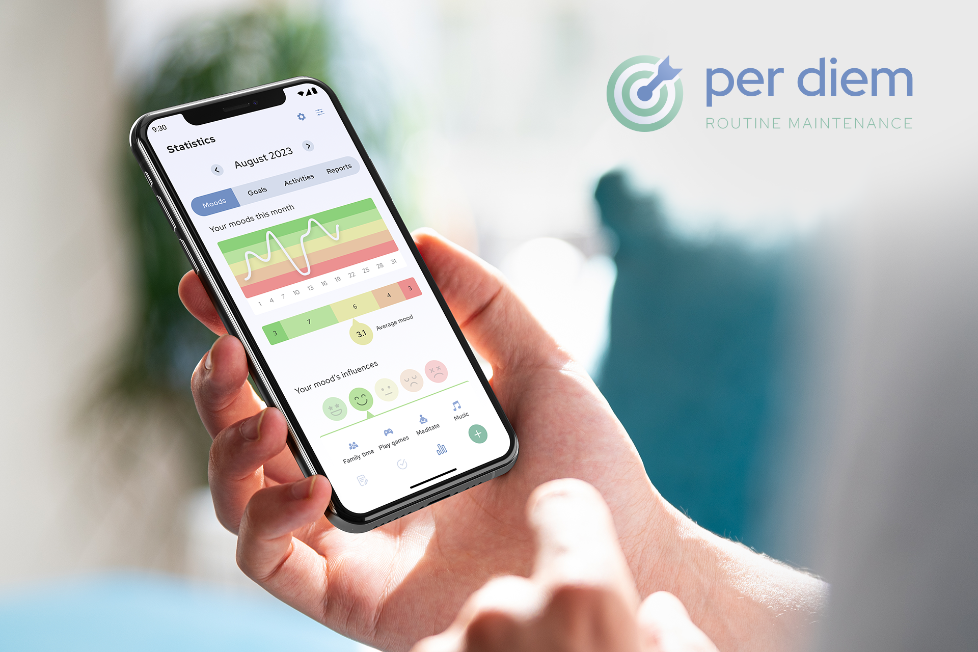
per diem is a mood, habit, and goal tracking app designed to induce self-reflection and increase a user’s understanding of themselves.
Users create logs of their mood daily, tracking their activities for the day as well as their goals. per diem uses these logs to create insights for the user through data; it shows a user how they felt when they completed a certain activity, empowering them to act mindfully in their day-to-day life.
I’d like to note that this UX case study was completed through the Google UX Design Professional Certificate program. It helped me deepen my knowledge in user experience design, and helped formalize some of what I’ve understood through experience in my career.
Research
Foundational research
I initially wanted to explore this topic through design for my own selfish reason: I’m a daily user of apps in this space, and I had some notes! And though that set me down this path to start, completing foundational interviews one-on-one really got me excited about the project.
I stated a few goals for my interviews before I began.
I want to understand common challenges people face trying to balance their lives and self-reflection
GOAL #1
I want to identify frustrations people experience while tracking their moods and habits
GOAL #2
In selecting participants, I targeted people of different genders and backgrounds, as well as people who had experience tracking their moods or habits (through apps, therapy, or other means). I wanted to find the pain points of both experienced and new users, so I could synthesize their specific needs into one holistic solution.
5 interviewees were selected with this in mind.
The problem
Across the interviews, I noted common challenges users had in their experiences.
Respondents unanimously felt difficulties in making time and space for self-reflection, even with the use of apps to help ease the process
CHALLENGE #1
Respondents attested specifically that reminders weren’t always effective
CHALLENGE #2
Respondents often remarked that they hadn’t felt that one single solution addressed what they were looking for (inclusive of mood, habit, goal, and intention tracking)
CHALLENGE #3
Respondents across the board desired an app with a calm, clean, and unobtrusive visual design
CHALLENGE #4
These interviews ultimately led me to define my problem:
Users need an effective, simple app that combines mood, habit, and goal tracking because they want as few barriers as possible between them and self-reflection.
So, how might we design this effective, simple app that combines mood, habit, and goal tracking, while also reducing the barrier of entry on a day-to-day basis?
Empathizing with the user
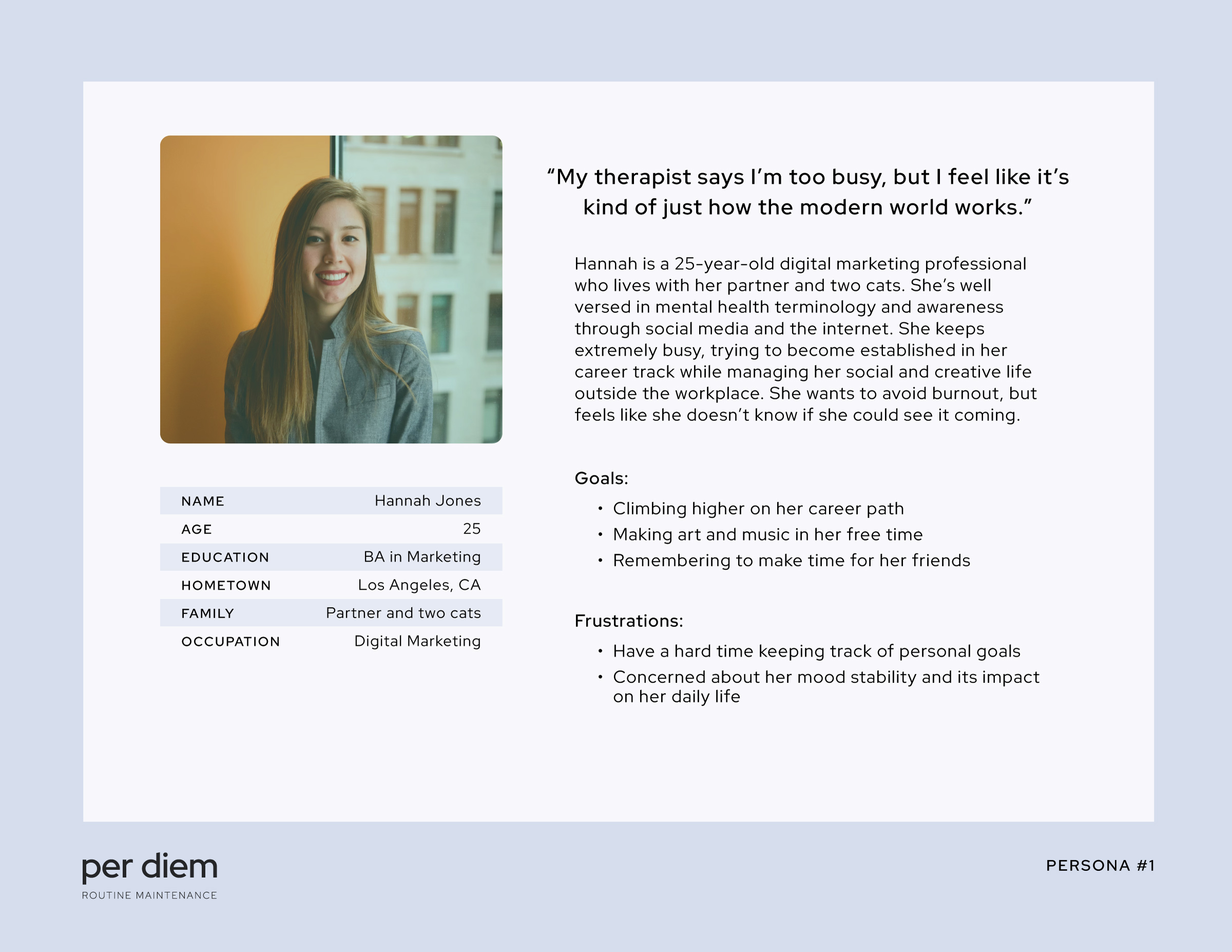
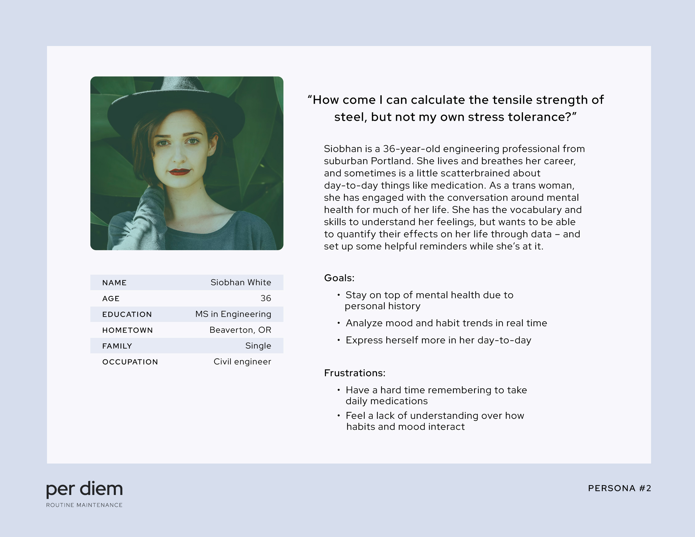
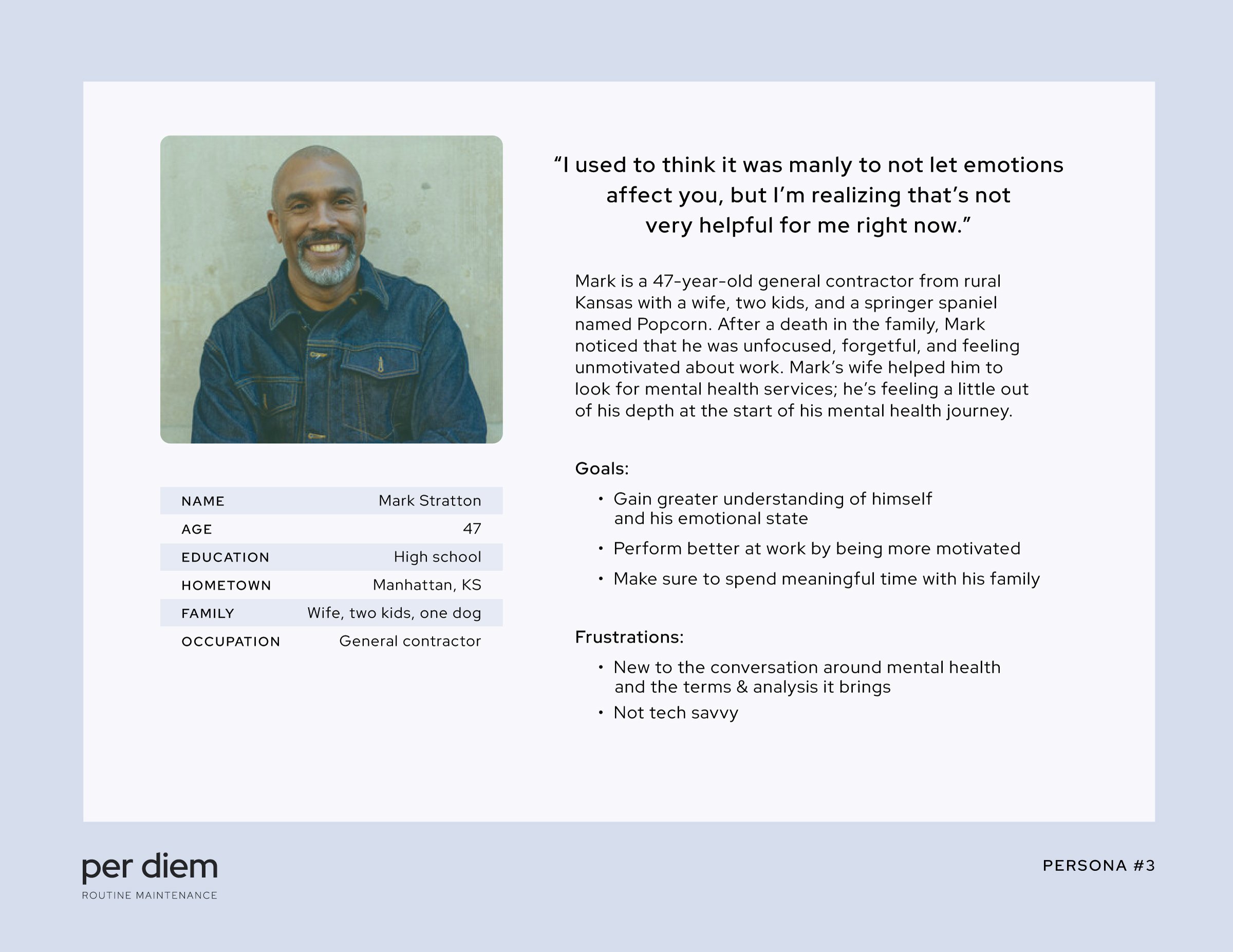
Through my research, I created 3 personas to help understand and represent my users.
Competitive analysis
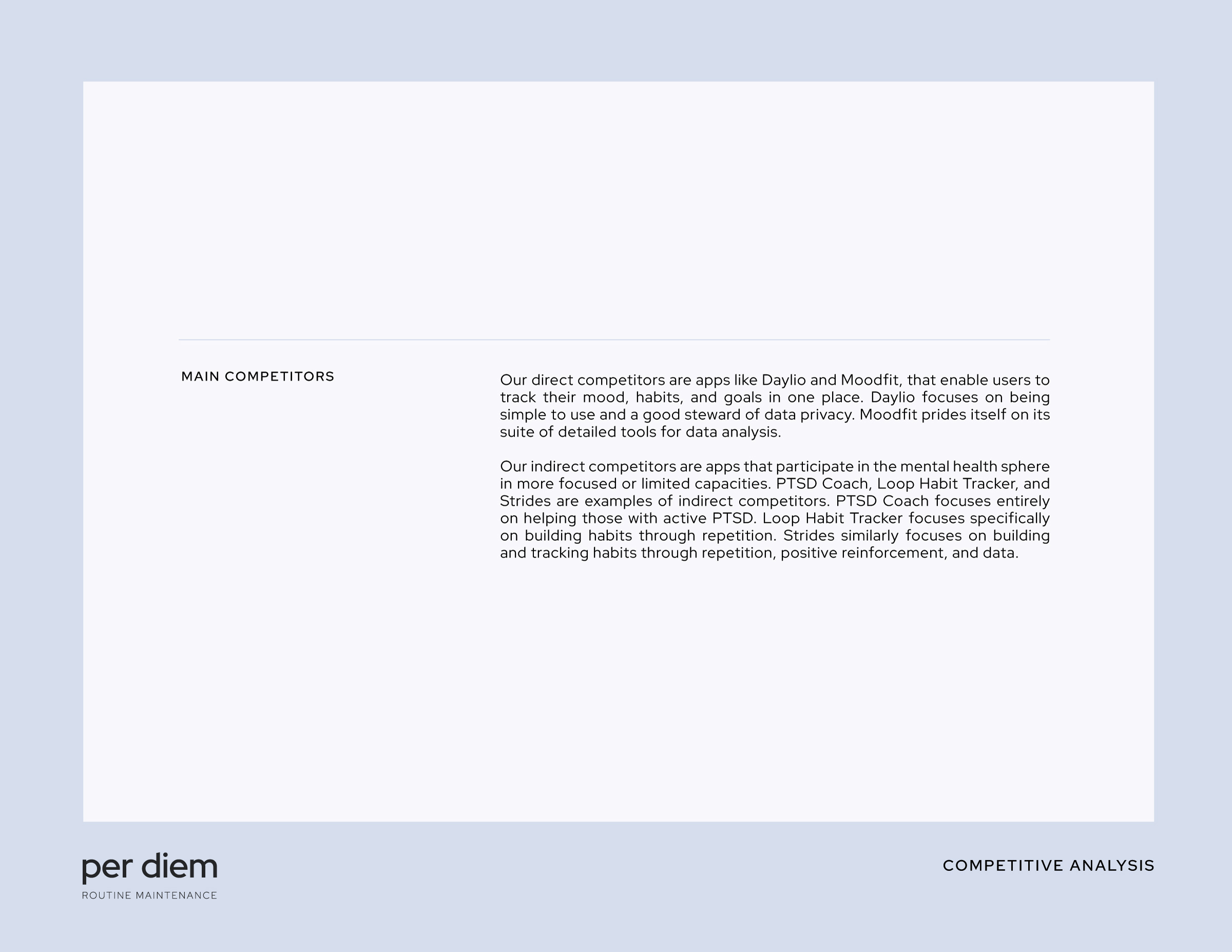
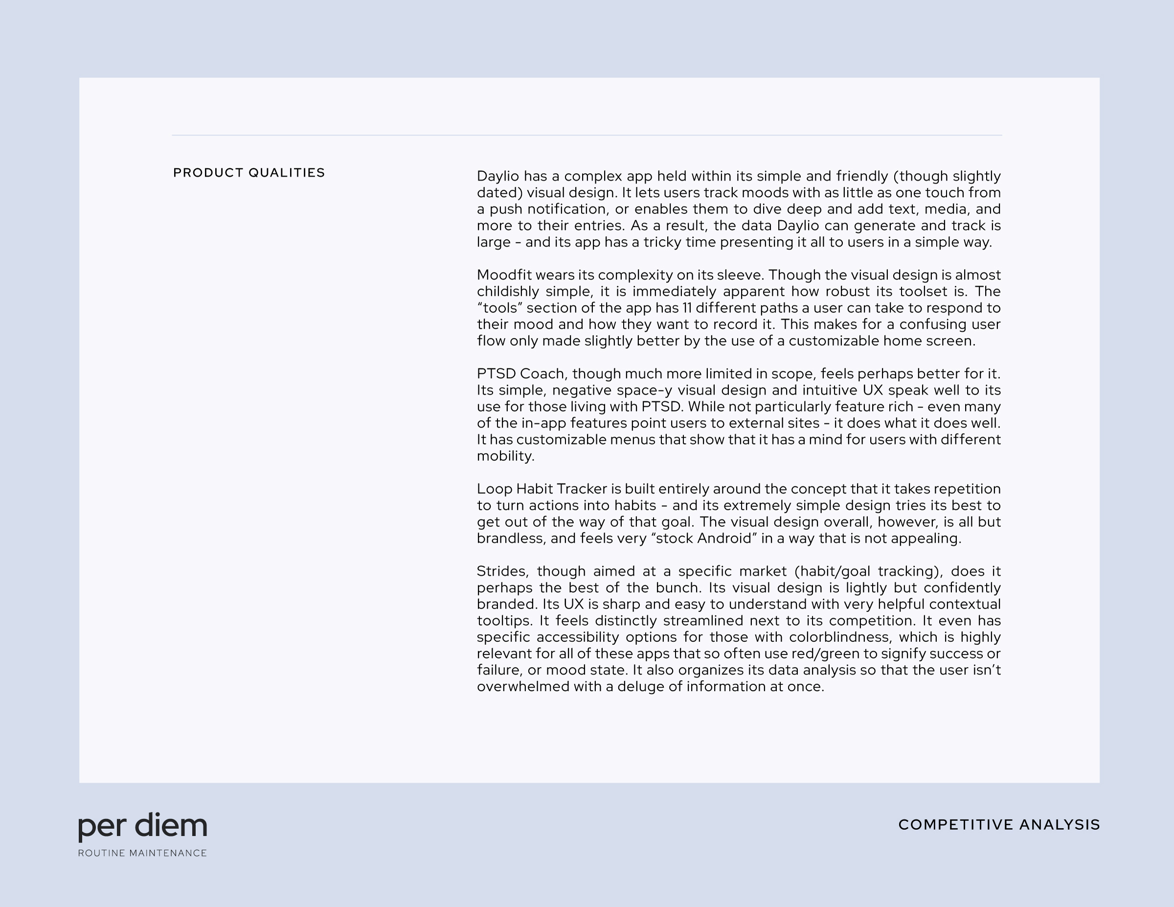
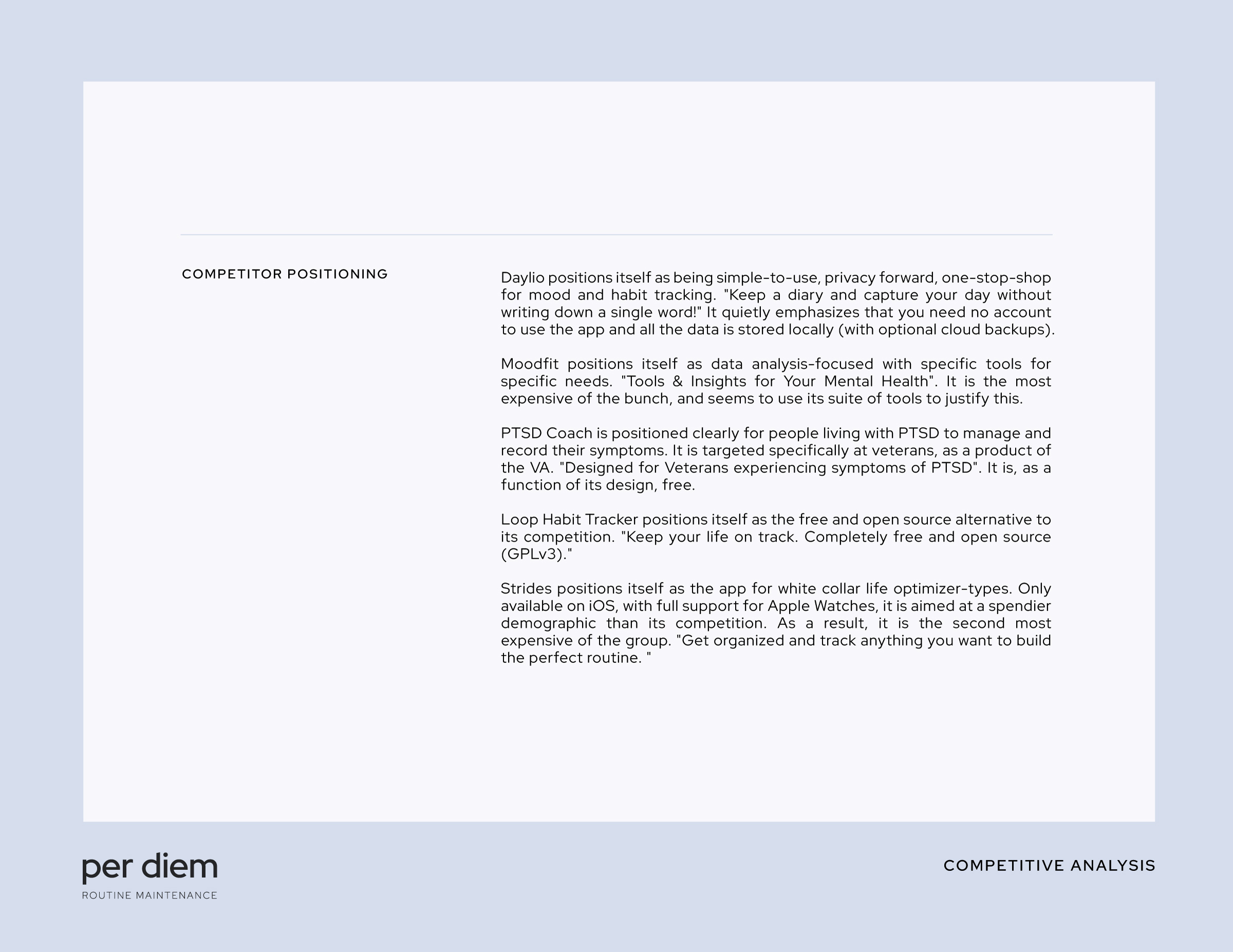
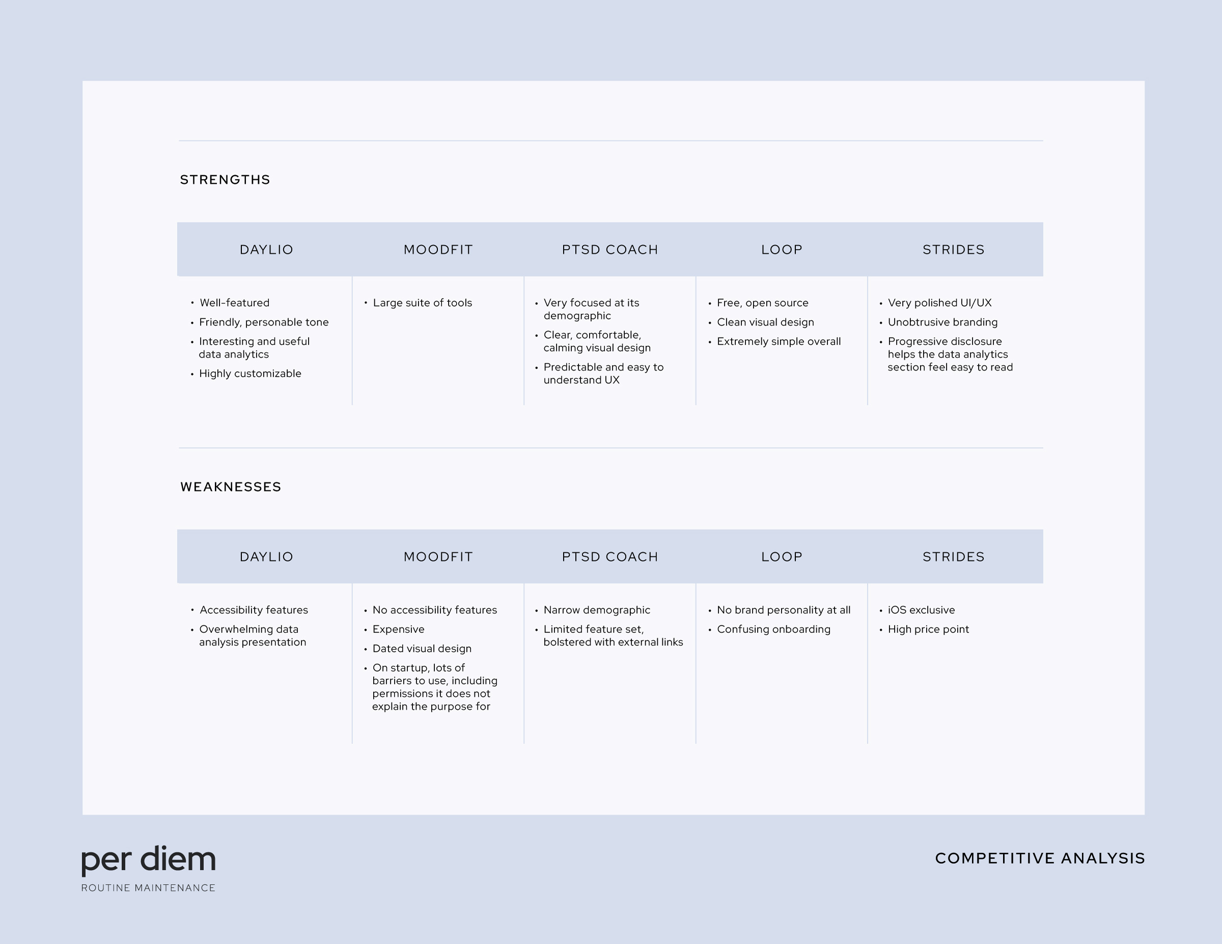
Because per diem’s core concept is essentially “do what the competition does, but do it right“, I carried out competitive analysis of both direct and indirect competitors in this space to make sure per diem would be able to both cater to its users’ needs but also find its niche in a crowded market.
I felt bolstered by my foundational research, personas, and competitive analysis, and in their summation I saw a handful of specific opportunities for per diem:
Focus on clean, modern design with intelligent use of negative space to lower mental load
OPPORTUNITY #1
Employ progressive disclosure to ease users into lots of data or long forms
OPPORTUNITY #2
Ensure that reminders are a seamless, highly-customizable, and integral design feature
OPPORTUNITY #3
Include UI customization and specific colorblind-friendly design for accessibility
OPPORTUNITY #4
Ideation
With some highly informative research in the books, I began developing how best to solve the design problem at hand.
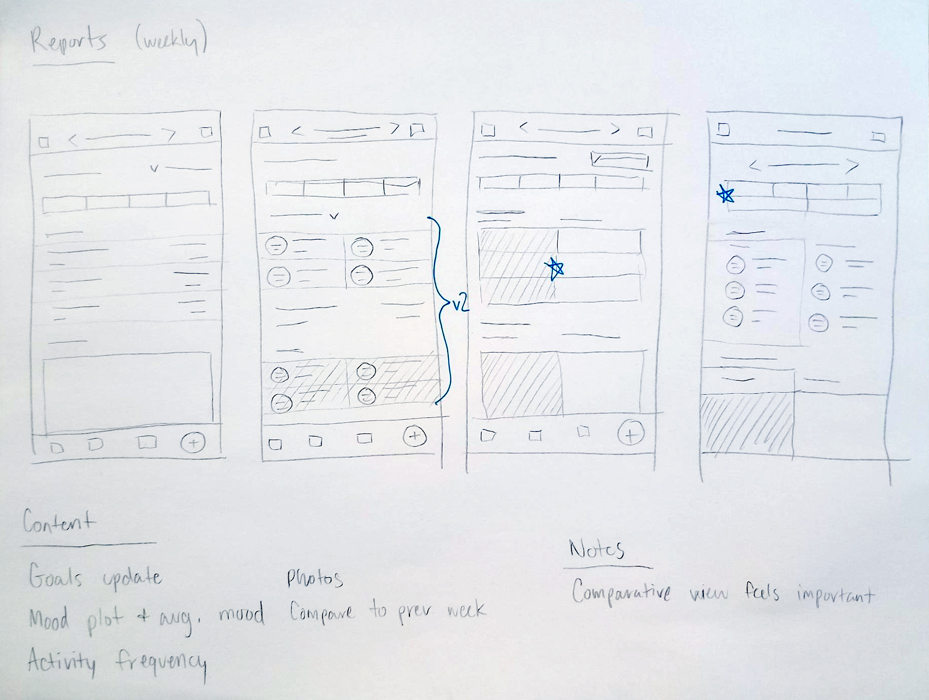
Paper sketches
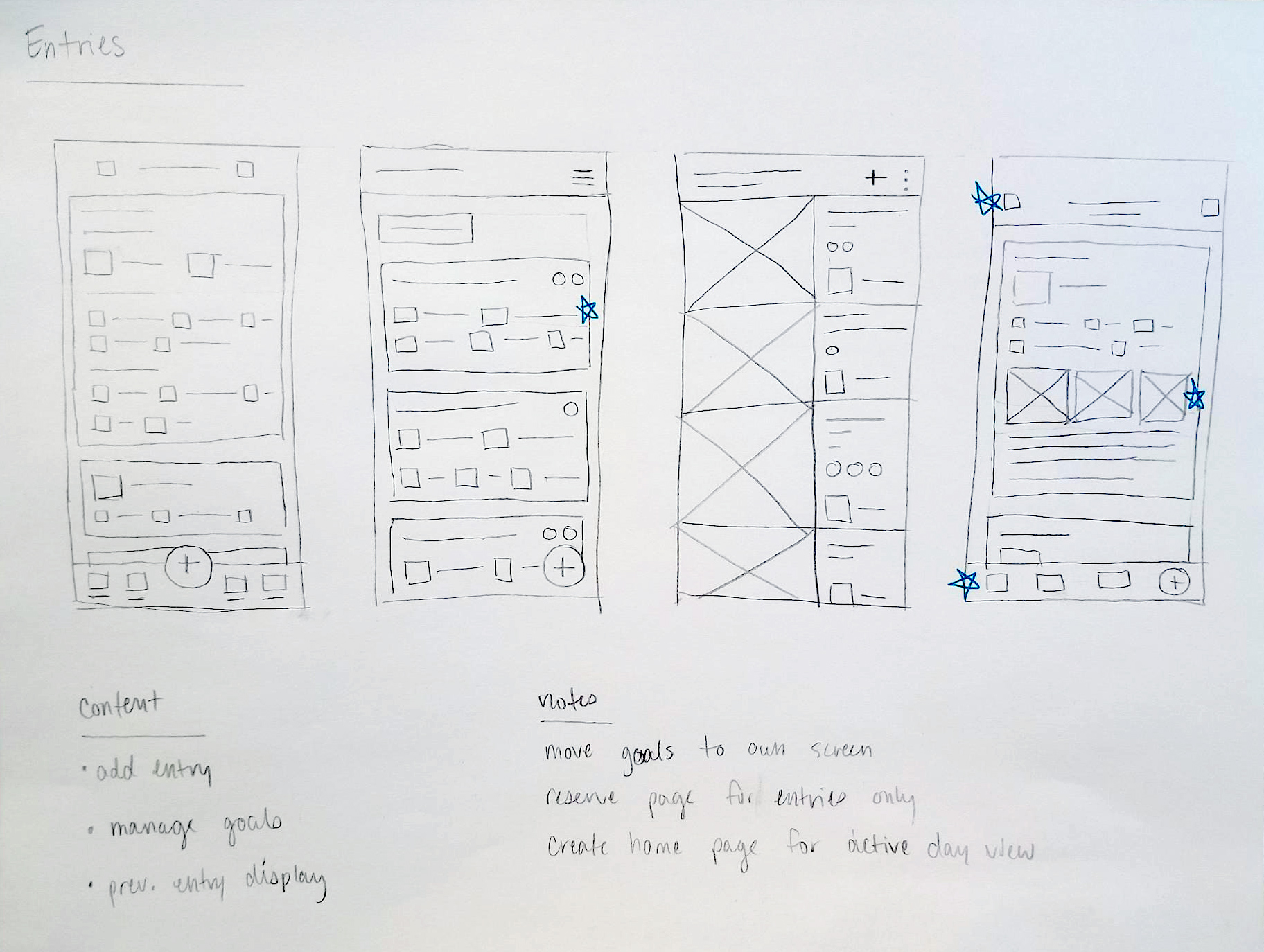
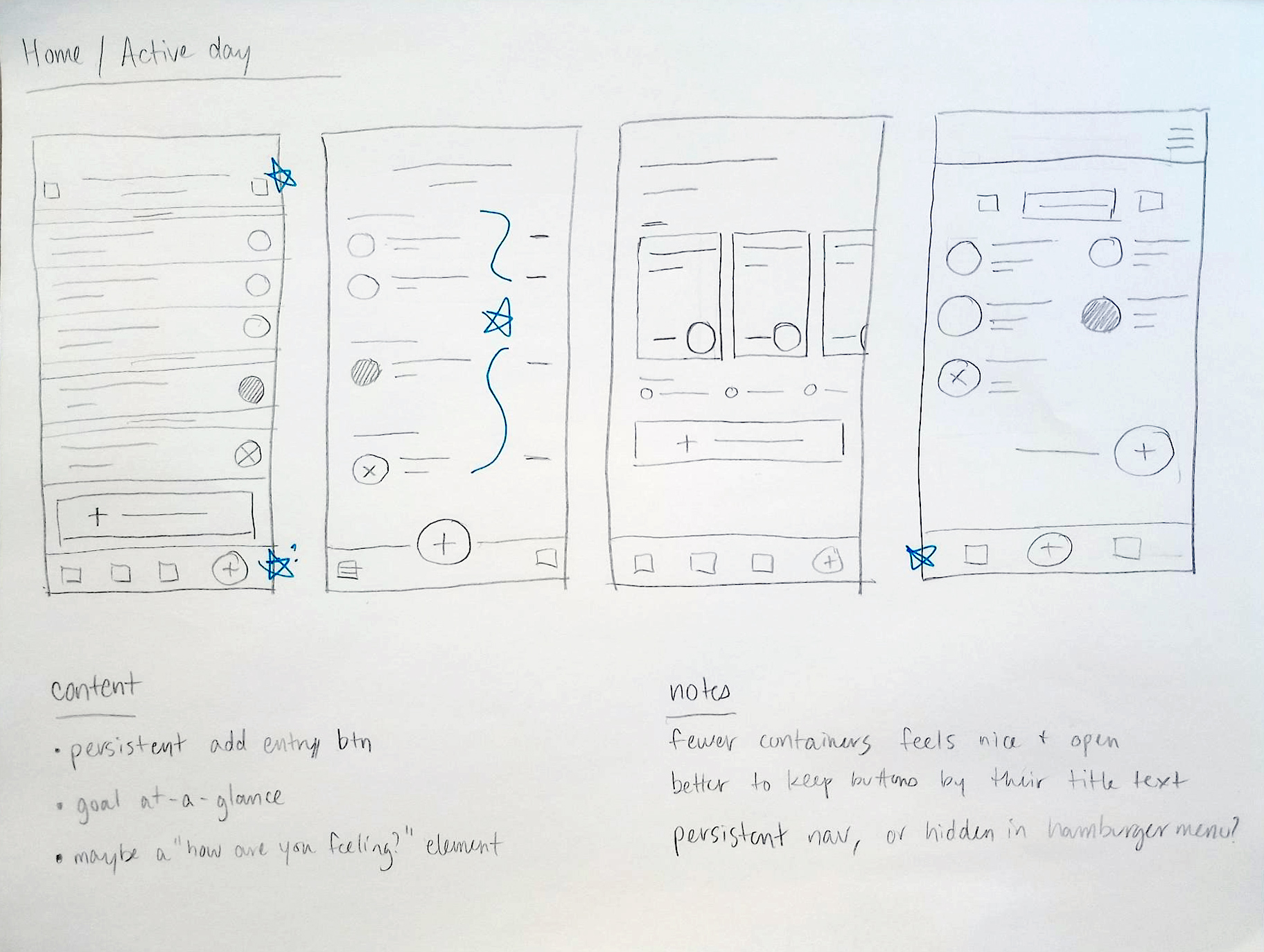
I don’t think I’ve ever had a great idea that I didn’t first hash out with a paper and pencil, so I started there…
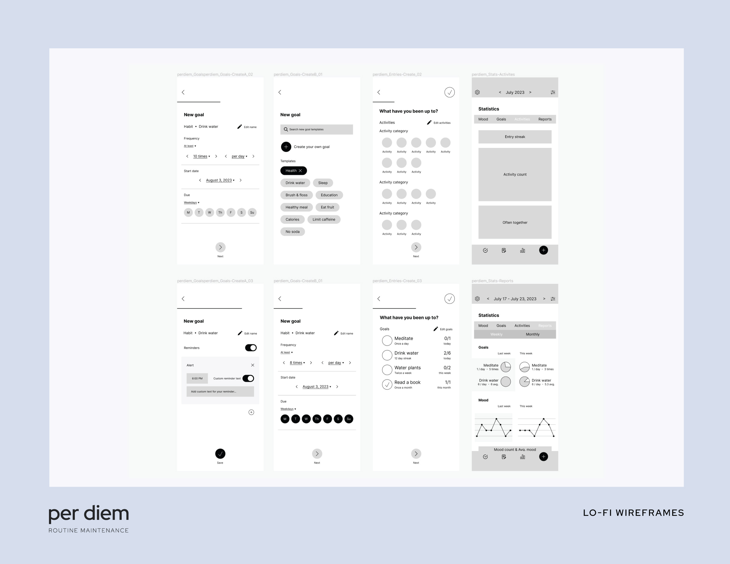
Lo-fi wireframes
After deciding on a direction based on my sketches, I put together lo-fi wireframes in Figma. With these wireframes, I developed a basic prototype that users could click through to get a feel for the app, and I conducted informal moderated studies of friends and family to see it in action.
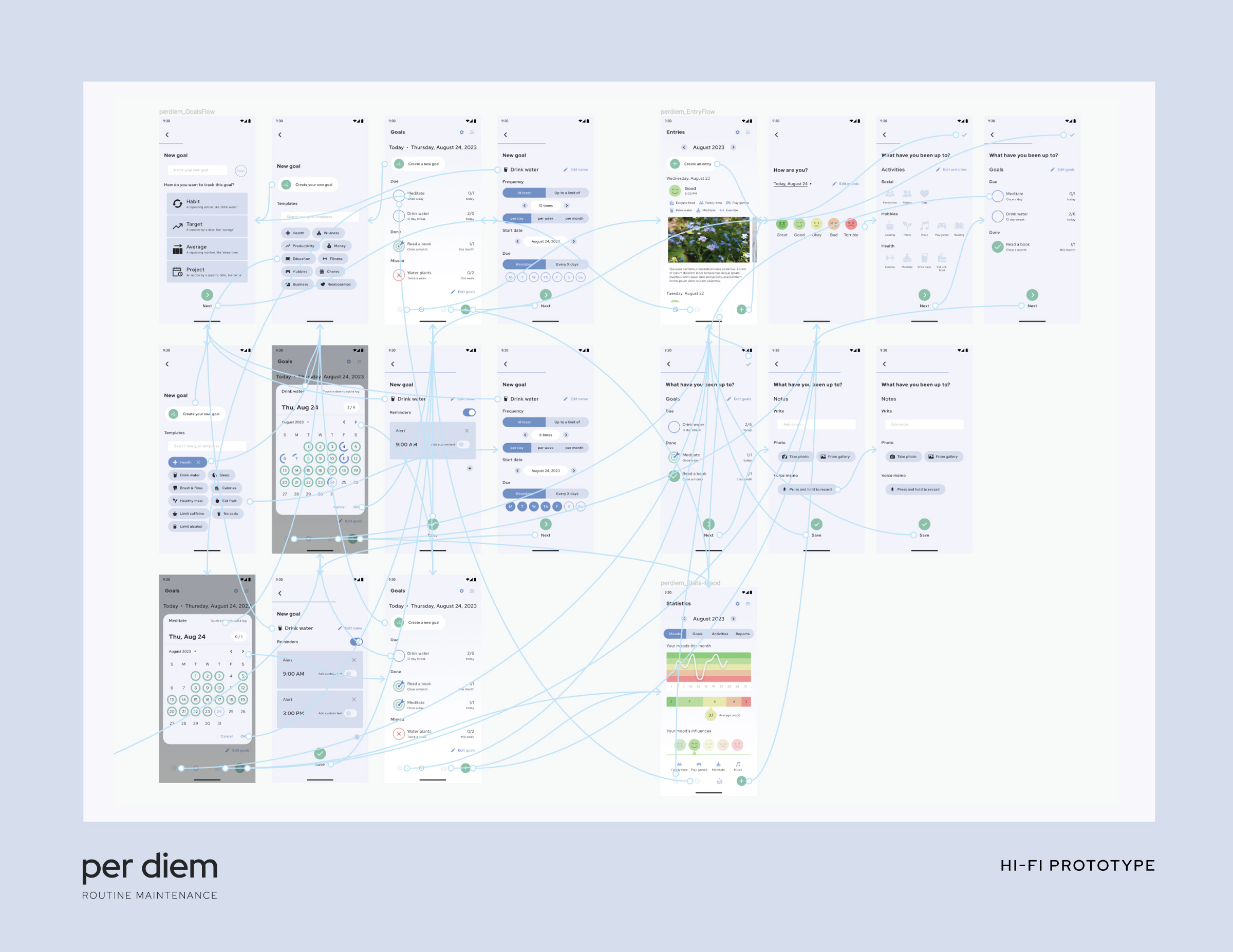
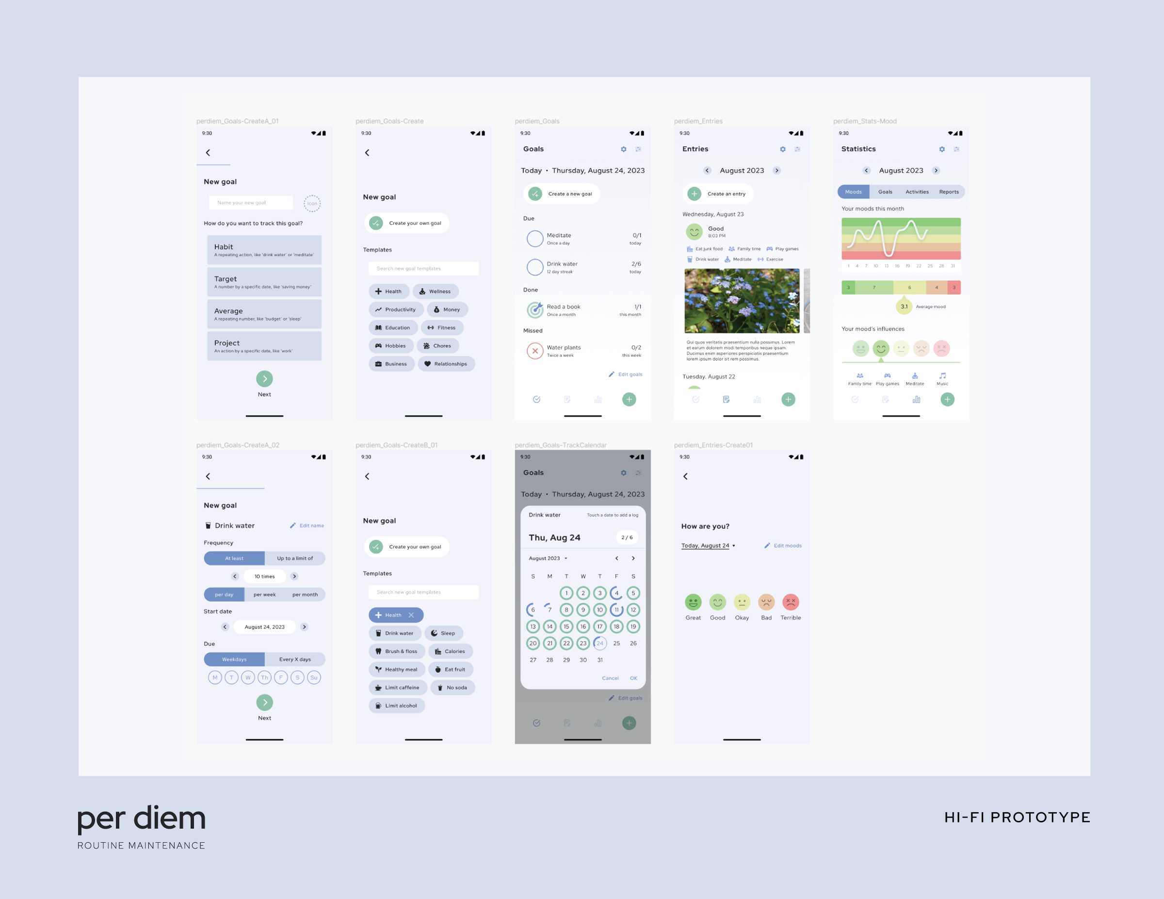
Hi-fi prototype
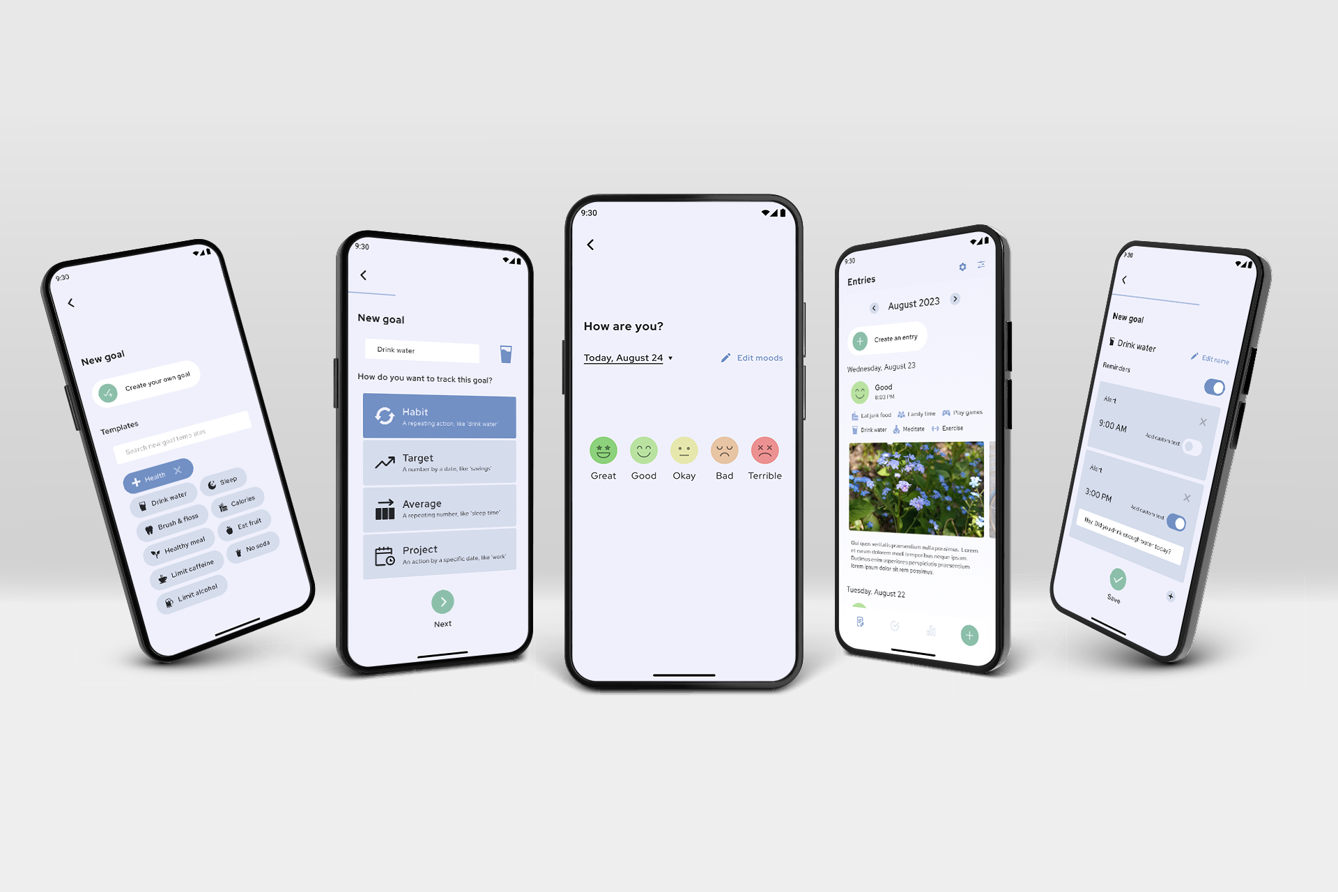
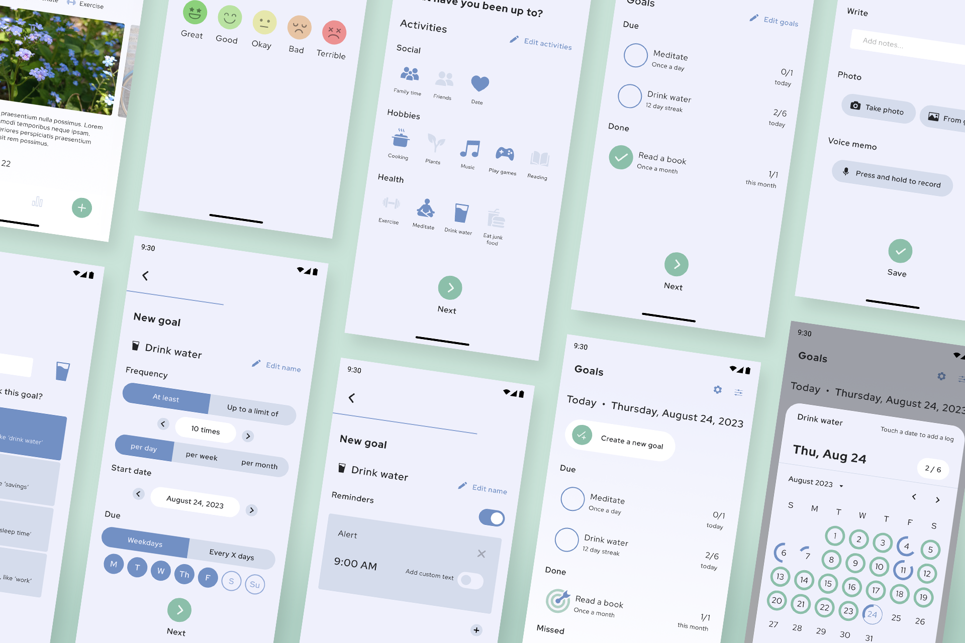
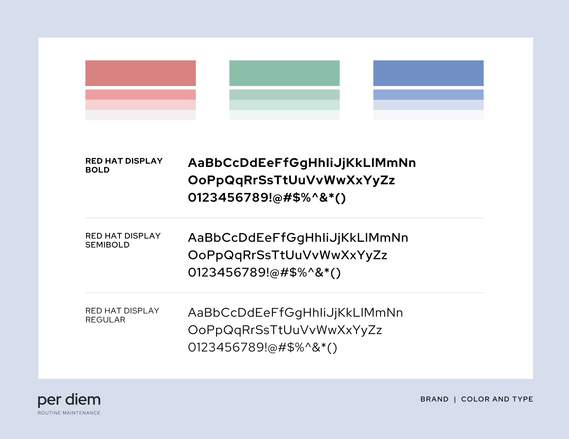
With confidence in my wireframes, I proceeded into the high fidelity prototypes. During this phase, I began by developing a clean, friendly, and calm brand aesthetic.
My palette and typefaces selected, I proceeded to bring per diem to life in Figma.
Testing
Hi-fi designs in hand, I crafted a usability study plan in order to make sure my designs best serve the user.
Usability test
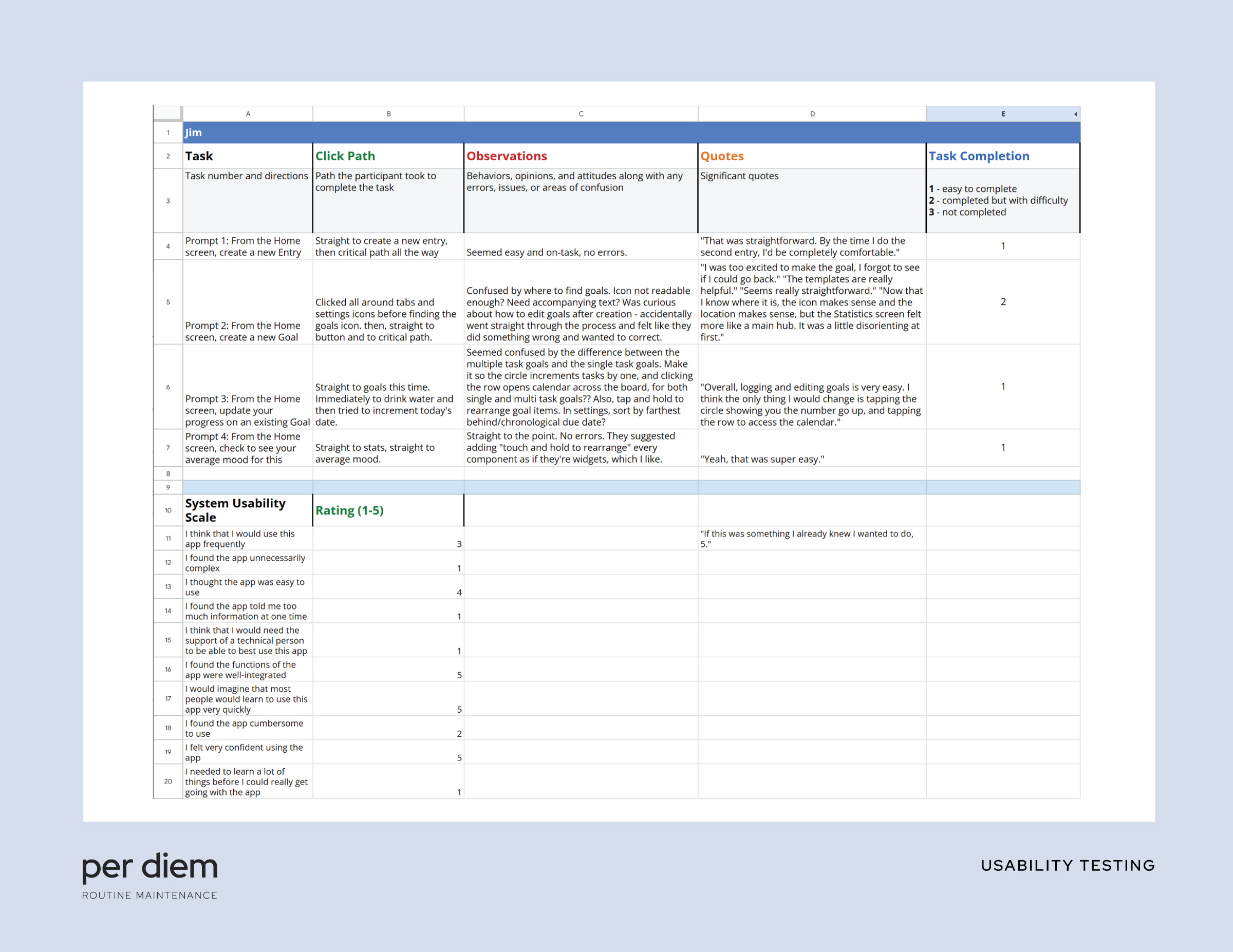
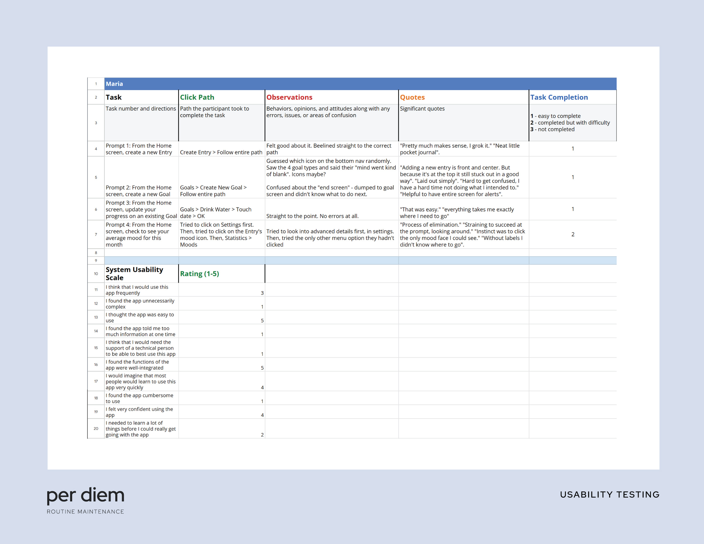
In my usability study plan, I made sure to recruit users from diverse backgrounds and abilities, including people with red/green colorblindness to gain insight into how the subtle palette I devised holds up. I conducted a series of 1-on-1, moderated studies online. During these studies, I prompted users to complete simple actions in the app and discussed with them how they felt about it, monitoring their time on task, error rate, and conversion rate. I finished with a System Usability Scale questionnaire to get some slightly more quantitative data. The data below is anonymized.
I was thankful to get positive overall responses! That being said, through this round of testing, I gained some actionable insights to improve my designs right off the bat.
Users lagged on pages with too much text, like the first page of the New Goal dialog. This could be improved with iconography
ACTION ITEM #1
The different UX between single-use and multiple-use goals confused users, and could be unified
ACTION ITEM #2
Several users remarked a desire for customizing the display order of the Statistics page, which would make a great post-MVP target
ACTION ITEM #3
It was fascinating to watch users interact with this prototype in real time, and exciting to be able to incorporate their notes to make a better product.
Results
Based on my research from start to finish, per diem evolved into a streamlined mood, habit, and goal tracking one-stop-shop. It has a clean, clear, and calm UI and a gentle but lively brand identity. It was a joy to bring it into the world!
